
-
DOWNLOAD
Your Content Marketing Checklist >

-
REQUEST TODAY
A Content Consultation >

Most creative agencies describe their process in the abstract – collaborative, insight-led, audience-first – but rarely show what those words mean in practice. So here is one attempt to do it differently: a single cover article for issue 83 of Bentley Magazine, walked through stage by stage, from brief to finished feature.
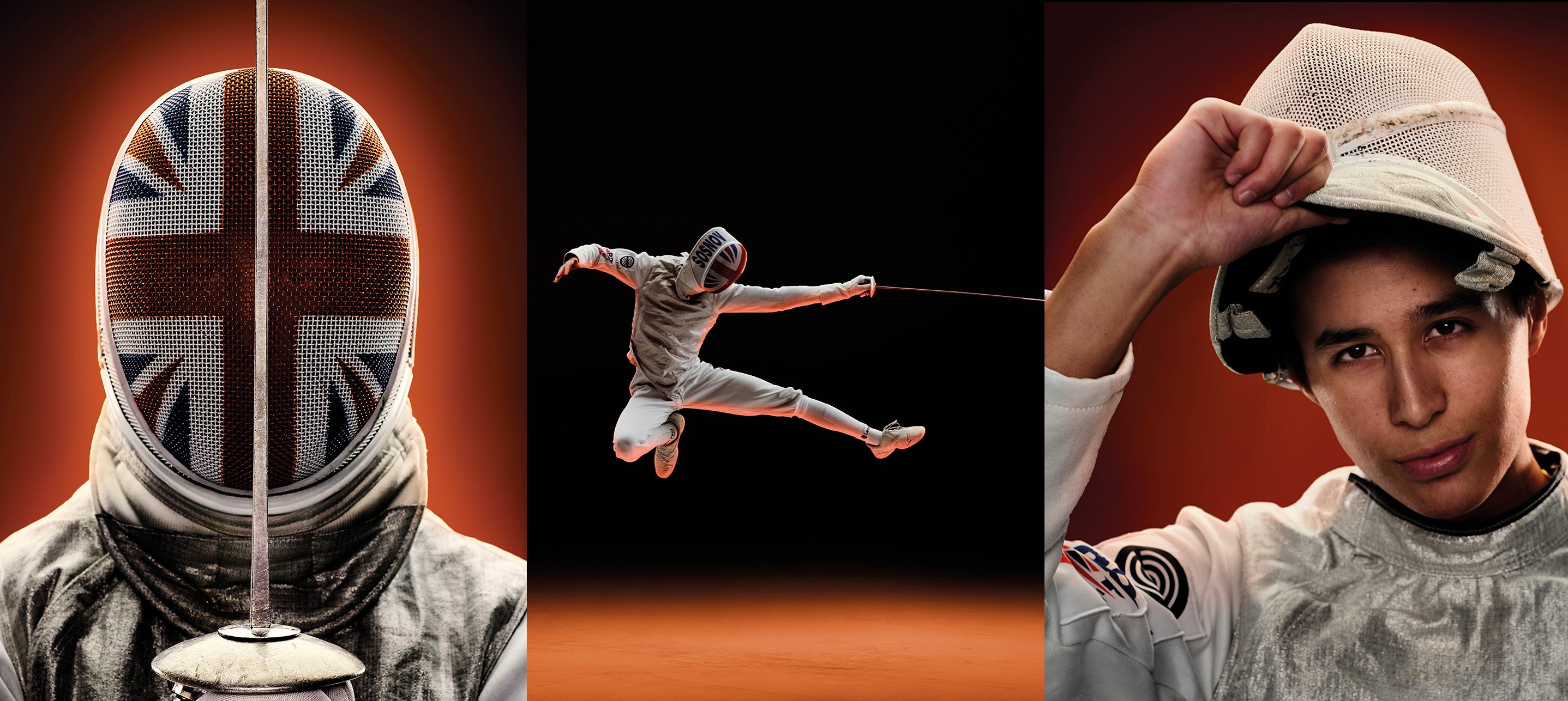
The piece was ‘Dual power, duel possibility’. It paired the new Flying Spur Speed with accomplished young fencer David Sosnov in a studio shoot where light attached to the foil revealed the path and geometry of his movement. Getting there took a whiteboard session, plenty of ruled-out ideas, one shrewd observation about a grille – and, on the day itself, a photographer, athlete, writer and retoucher all adding something that made the idea stronger.
The brief
We needed to feature the new Flying Spur Speed in the magazine and, although there was plenty to say about what had changed beneath the surface – refinement, capability and driving performance – visually the car was deliberately subtle. This was not a radical redesign or a shape that announced itself noisily. The challenge was not simply how to signal performance, but how to express a more Bentley kind of power: composed, assured and held in control. Because the car was under embargo, it also could not be taken on the road. Studio or private property only.
We had covered the Flying Spur many times over the years. There had been location drives that leaned into performance and studio shoots that focused on design and detailing. Repeating either approach was not going to produce anything worth the reader’s time. What we needed was a fresh angle, inside a tight set of practical constraints, for a car that was subtly new and whose Speed suffix made power central to the story.
What we knew before we started
Neither the Flying Spur nor the Speed edition are track cars. It is large, comfortable and often chauffeur-driven. When Bentley talks about performance in that context, it means handling, composure and capability – not smoke-off-the-tyres speed. The obvious routes, from circuit photography to the usual visual shorthand of motion, did not suit the car or what the brand wanted to say about it. We needed a way to communicate energy without noise, precision without aggression and power without dropping the refinement that defines the model.
We also knew the audience. Bentley Magazine’s readers are ultra-high-net-worth individuals for whom sport is part of the cultural landscape, but not necessarily in its most mainstream forms. And when we looked across the magazine’s run, sport was a noticeable gap. We had covered wellness, travel, food, music and art. Sport had barely featured. So the Dialogue team went into the ideation session with a working hypothesis: performance expressed through a sport whose discipline, control and visual precision could mirror the character of the car itself.
The ideation session
We bring together as broad a group as we can for these sessions – designers, editors and account managers from across the agency. The breadth is deliberate. The unexpected connection usually comes from someone who is not already carrying the full weight of the brief.
We start by laying out everything we know: the product, the client’s angle, the practical limitations. Then we set those limitations aside and ask the room: if you had this car tomorrow, with unlimited budget and no constraints, what would you do with it? Ideas start big. They get dragged down into reality later. But beginning without restriction matters, because the best ideas usually start somewhere slightly out of reach.
For this session, we moved through sports quickly. Football was the wrong register entirely. Boxing and other combat sports had edge, but too much aggression. Polo and equestrian sport had some of the right associations, but did not quite fit the Bentley audience, and they came with practical complications too. The idea had to feel active, visually distinctive and contemporary enough to sit comfortably alongside the car. It also had to be British – the car could not leave England, which ruled out anything requiring an international shoot.
Fencing came into the conversation through a combination of logic and one specific observation. The a-ha moment.
The moment the idea clicked
We were exploring sports that felt long established and fencing was raised and immediately made sense – the visual distinctiveness of the sport, its relative unfamiliarity to a general readership, the physicality of the athletes, and the fact that its equipment carries more modern technology than its history might suggest. Then we got to the mask. Specifically, the grille of the mask. Bingo.
The Flying Spur has a substantial front end – grille-heavy, with real physical presence. The mesh of a fencing mask carries the same geometry: the same grid, the same sense of something significant being behind it. What is hidden behind the mask? The face, the expression, the character of the person wearing it. What is behind the grille? The engineering, the capability, the character of the car. Even if that parallel never appeared explicitly on the page, it gave the concept its internal logic. The sport and the product were not simply placed beside each other – they were in a genuine visual conversation.
Once fencing was on the table, the idea sharpened quickly. It gave us a way to think not only about power and restraint, but about line, shape, rhythm and control.
Finding the right fencer
The next step was to find a fencer and shape a feature that could carry those parallels without forcing them – not just drawing a line between athlete and car, but letting both speak the same visual language.
We wanted someone on the way up rather than already installed at the top of the sport. British Fencing put us in touch with David Sosnov – 18 years old, already with a string of junior titles behind him and tracking towards Olympic selection. What we did not know at first was that his story went well beyond results. His father had been an Olympic fencer, as well as his coach and mentor, and had tragically died in a swimming accident. David had kept competing. Bentley’s line for the car was “the power of the possible” and David was already living it, against all odds.
We also needed a writer who knew the sport. That search led us to Sian Hughes Pollitt, a BBC journalist with substantial fencing coverage to her name. Our brief asked her to write about David’s world with enough depth to sustain a magazine feature while finding the connective tissue between athlete and car – not in an overworked way, but through shared qualities of precision, discipline and controlled power.
The shoot
Working in a controlled studio environment gave us options we would not have had on location, and this concept needed that control. We partnered with experienced automotive and lifestyle photographer Sam Chick, whose contribution was to turn the conceptual territory into a photographic treatment. In those initial briefing discussions with Dialogue’s creative team, Sam became interested in “tracing and visualising the notional lines left by the athlete and foil” and weaving them into the images and around the car. It was the point where the connection between athlete and car became something we could physically create in the studio.
That thinking shaped the shoot from the start. What sounded elegant in principle was exacting in practice: over two days in the studio, the idea had to become technically precise enough to work on camera. As Sam put it, “A high level of finesse is expected with a client such as Bentley, and careful planning and testing is crucial.” Much of day one was spent pre-lighting the car and testing how the fencer, foil lights and reflective surfaces would interact, so the effect felt embedded in the image rather than applied afterwards.
Sam’s approach was to build the image in layers, giving each element enough care to feel deliberate rather than forced. The car, the fencer and the light trails were captured separately, then brought together with enough control for the final image to feel seamless. That mattered because the concept depended on the light doing more than decorating the frame. It had to feel as if it belonged there – tracing David’s movement while echoing the styling lines of the car.
The foil-light detail captures the mix of precision and improvisation behind the shoot. Sam needed a light source small and powerful enough to sit on the foil without overwhelming the image. After testing everything from Christmas lights to drone navigation lamps – “in my garage with a bamboo cane!” – he landed on a light stripped from a children’s night light. It is exactly the kind of behind-the-scenes detail that reveals how much craft sits behind an image that looks effortless.
The subject
David was 18 and moved like he was made of springs. At 6'4" and supremely fit, he was also – for someone so young and so singularly focused on one discipline – very articulate about what fencing involved and what it demanded of him. We sat him in the car with journalist Sian and although he could not drive it – he did not yet have a licence – his response to simply sitting inside the Flying Spur gave the writer something genuine to work with. The whole thing would have fallen flat without him.
David also contributed from inside the movement itself. He understood how a lunge, extension or change of angle would read truthfully, and could help shape the poses so they carried both sporting authenticity and graphic strength. That kind of input is easy to miss in the finished image, but it is part of what made the idea feel lived rather than staged. Sam put it perfectly: “David absolutely brought the project to life and I’ve never seen anyone jump so high or far!”
That physical presence mattered. The car was a beautiful thing. The light trails added strong graphic elements. But David changed the atmosphere in the studio because the movement was real, the exertion was real and the reactions around him were real too. Sam, whose background includes years spent as a creative director focused on portraiture and fashion, said that although much of his photographic work is centred on cars, helicopters and watches, he still finds himself drawn to human reaction and interaction. “Ultimately David’s physical presence, talent and abilities drew gasps from us all.”
The cover image came from a close-up of the mask, its mesh echoing the grille, with just the faintest sense of David’s face behind it. Sam described that shot as relatively simple to capture once he had found the right lighting strategy and the correct balance “between the mask and a very subtle sense of David’s face inside”. The more difficult task, he joked, was persuading the rest of us that it should be the cover. To his mind it was never going to be anything else. He was right.
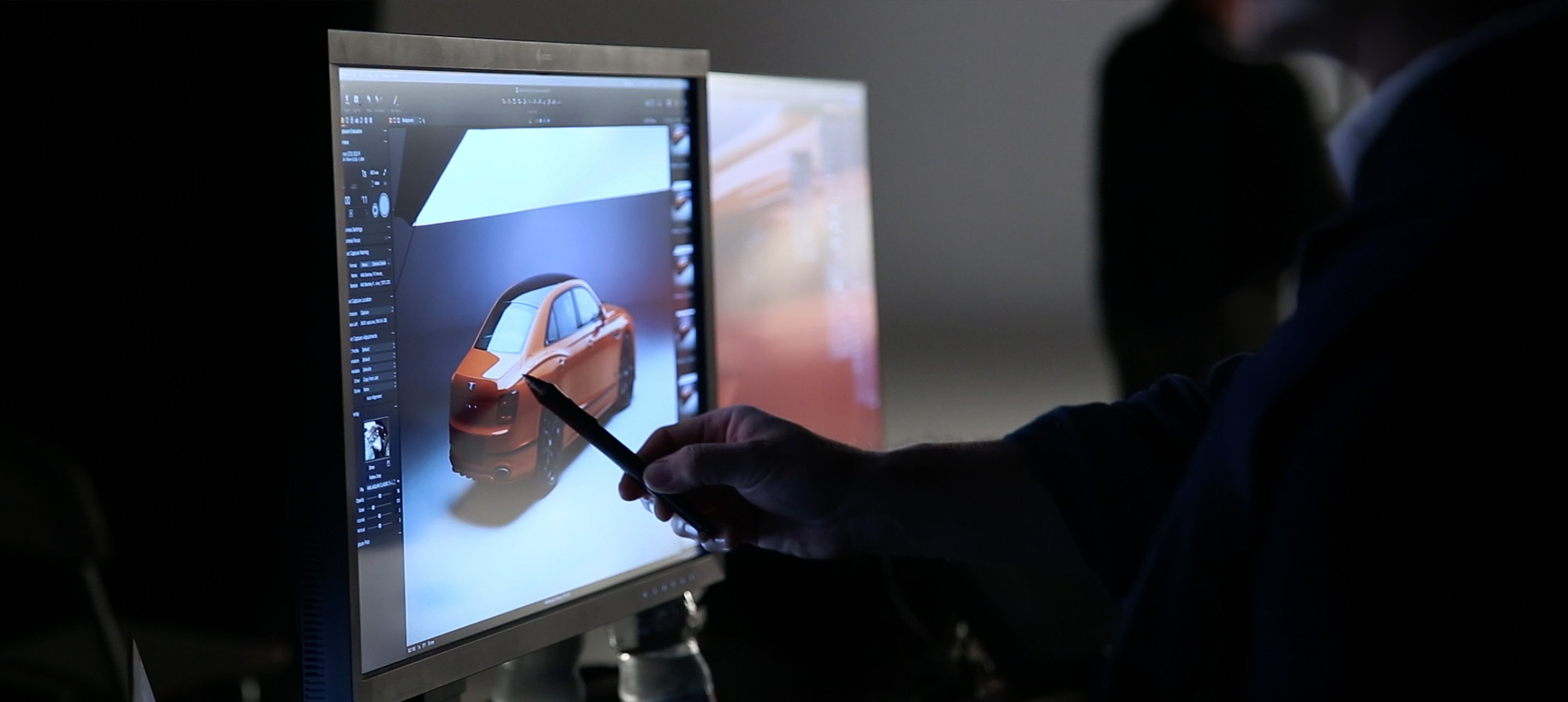
Post-production
Post-production was not an afterthought here; it was built into the way the shoot was conceived. Sam was equally clear about the value of having expert retoucher Tony Swinney from Mustard on site: “Tony is a good friend and valuable collaborator with a huge amount of technical skill and cultural capital – he’s much more than just a retoucher and brings his own sense of visual language and sensibility to the work. Since post production was so intrinsic to the final image having Tony present to begin live ‘builds’ of the images as we shot them was invaluable to a smooth and successful project along with ensuring client buy-in throughout.”
That live post-production process also mattered for practical reasons. The work involved shifting the car’s colour – the model available for the shoot was red, while the finished images needed to be orange – and compositing the separately shot elements into final frames that felt seamless rather than assembled. That sounds technical, because it was, but what mattered editorially was that the final pictures never looked laboured. They held on to the clarity of the original idea while carrying a great deal of invisible craft.
The result
Bentley Magazine is not a brochure. Bentley already has places where readers can find the full model range and specifications. What they cannot find there is an interview with an ambitious young athlete, staged in a visual world that says something meaningful about the car without lapsing into cliché. The magazine’s job is inspiration rather than information: to show how the Flying Spur Speed belongs in a life defined by precision, discipline and refined power.
What we still like about this project is that none of it was decorative. The idea came out of genuine knowledge: of the brand, the product, the audience and what the magazine was there to do. Once we were in the studio, it was strengthened by people who did far more than simply execute the brief. Sam picked up the line-drawing thought and turned it into something that could work in camera. David brought a physical presence that changed the atmosphere in the room. Tony helped us build the images live. Sian found the narrative joins that made the feature work on the page. Every part of it had purpose.
The final images brought those contributions together. The Flying Spur Speed appears poised and grille-forward, all contained force and assurance; David is mask-on, body coiled, cutting bright traces into the air. Together, they speak the same language: performance shaped by precision, and speed expressed with restraint.
The best creative ideas often look inevitable in hindsight. This one does too. But it only arrived because a broad room of people kept pushing until the internal logic clicked, and because the people making it brought more than the brief strictly asked for. That is what turns an interesting thought into a finished piece with depth.
If you need a creative partner who can turn a brief into an idea with real depth – and bring the right people together to make it work in print, digital or film – talk to Dialogue.


Read more insightful articles
See more from the blog Automotive
From brief to cover story: inside a Bentley Magazine feature
 Print
Print
The content confidence gap that costs luxury brands customers
 Content
Tactical gravity: why your cross-channel/cross-agency campaign is failing to deliver
 Content
Personalisation, purpose and a marketing strategy for the new world of luxury
Proud to be a winner of industry awards, recognised as content marketing experts in print and digital media.


